© Ryan Hartley 2026
Creative Director & Designer
Creative Director & Designer
Seagull - Connecting the global supply chain. A brand icon inspired by the company’s nautical roots, evoking movement, connections, and international reach.
Challenge
Seagull sought an identity and brand mark that captured a nautical look and feel while subtly incorporating an 'S' from their name. The brief was simple: “We want a logo like FedEx”, smart, simple and instantly recognisable.
Branding
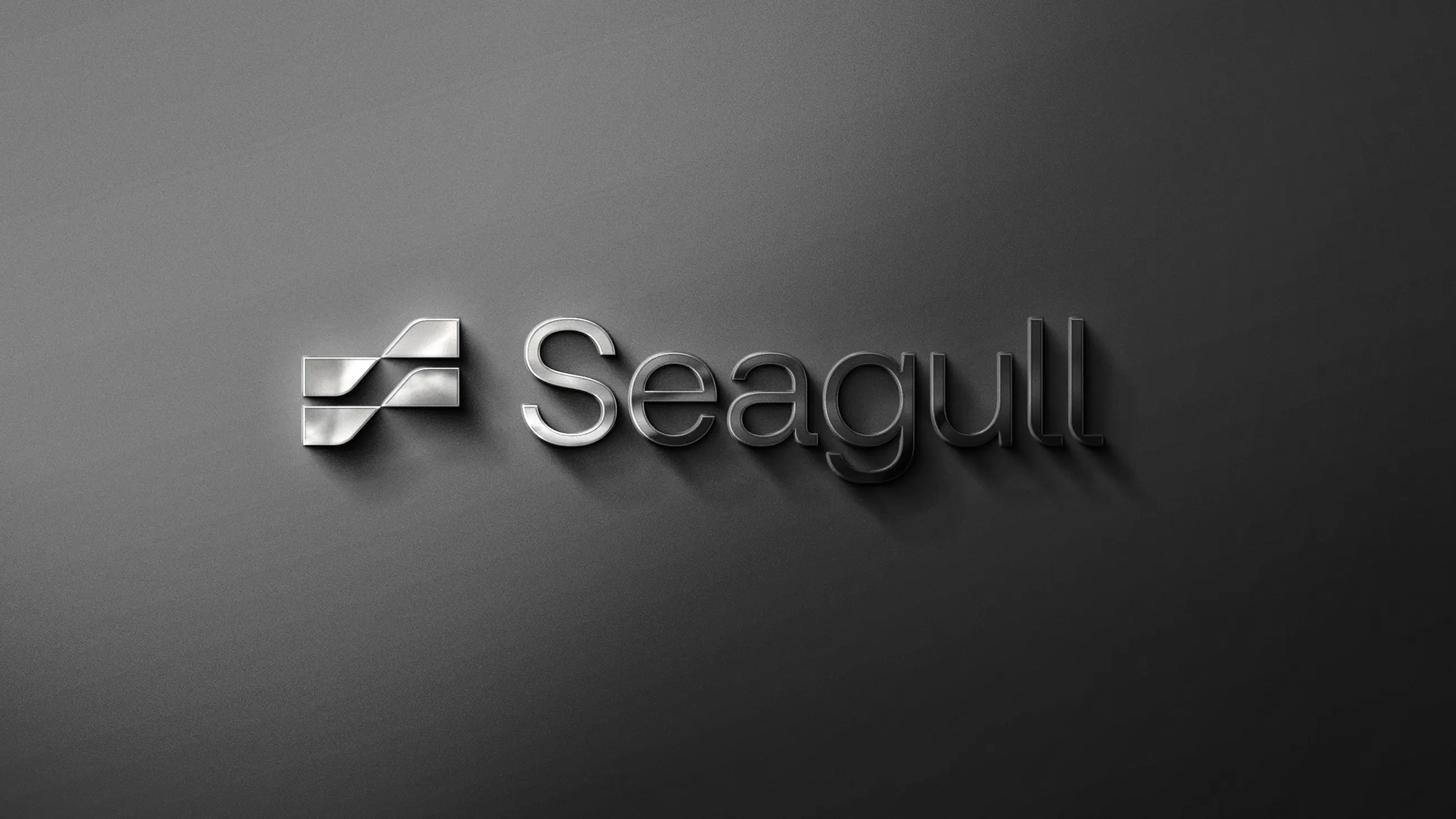
The Seagull brand icon reflects the company’s nautical heritage, with an ‘S’ subtly integrated into the negative space to create a distinctive and memorable mark. This visual element strengthens Seagull’s identity in the market and reinforces its commitment to excellence and innovation.
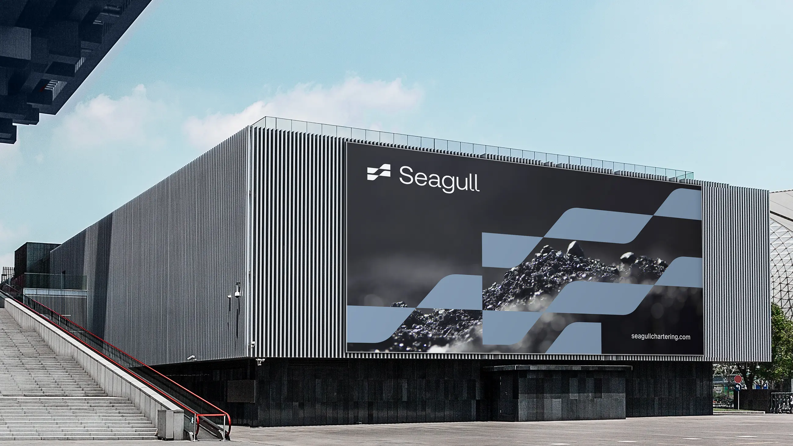
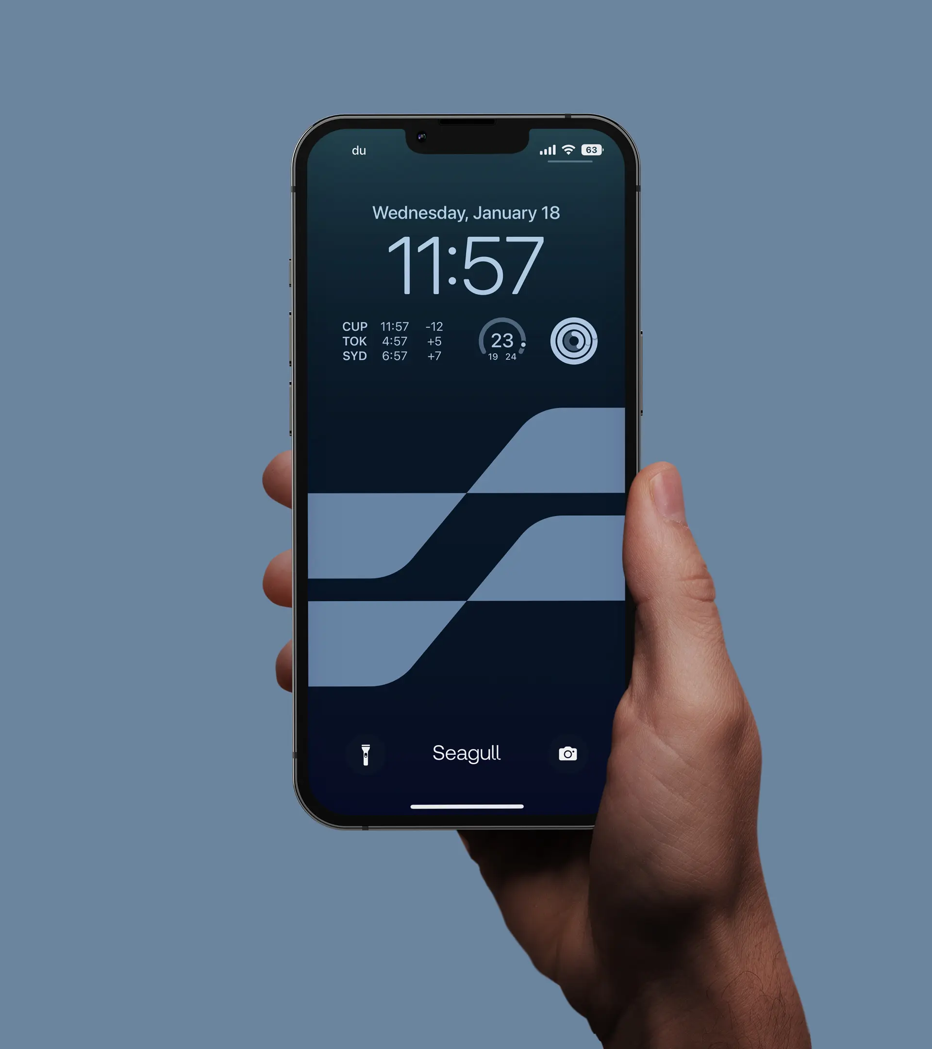
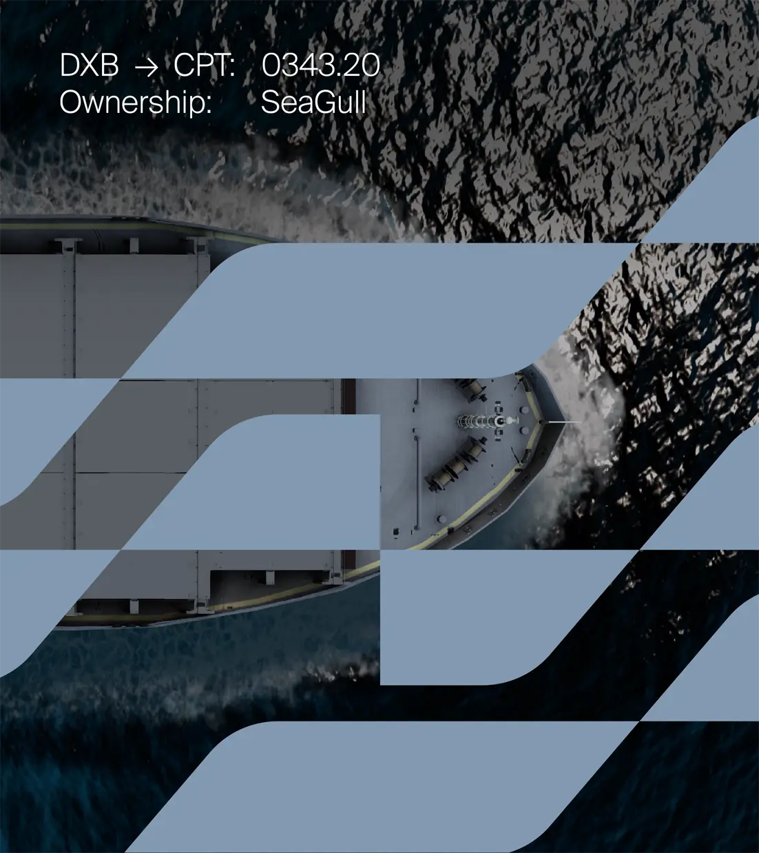
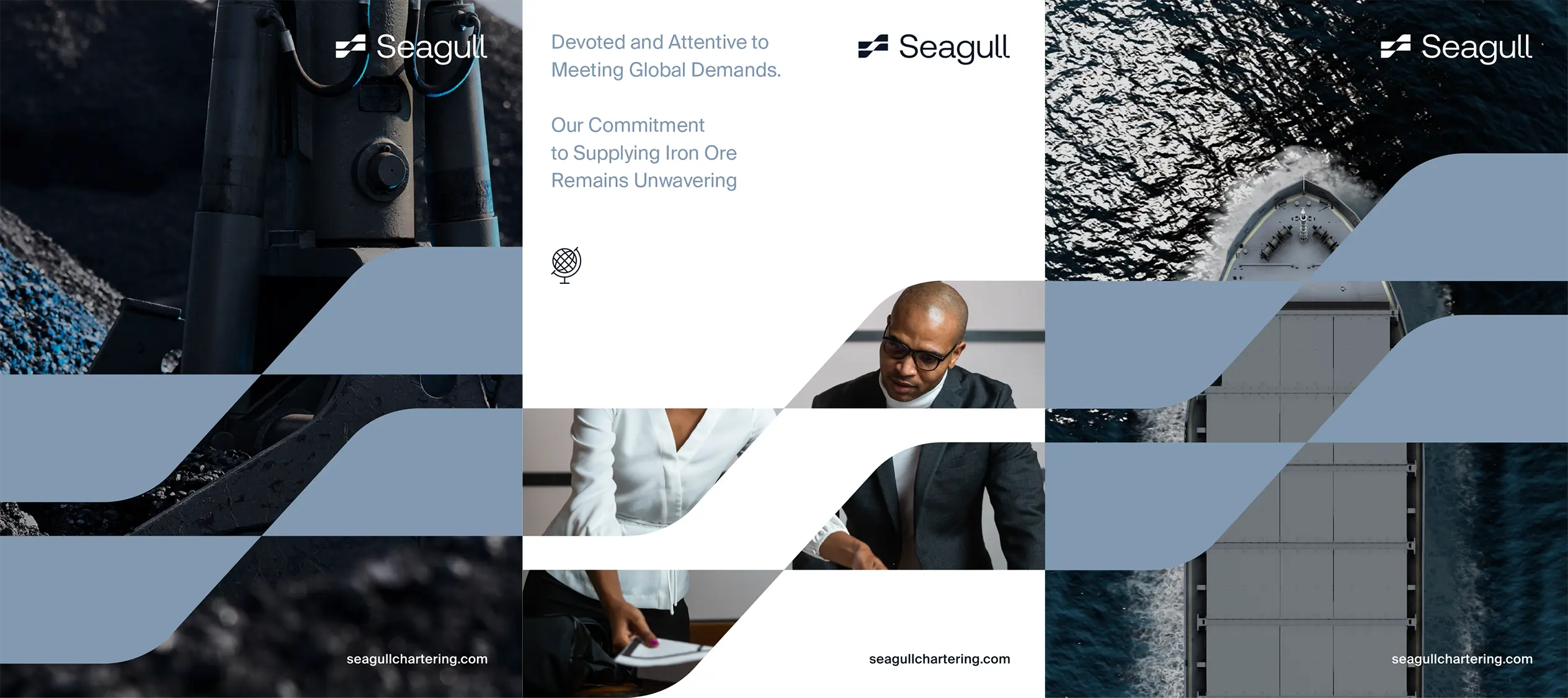
The supporting brand pattern connects buyers to the global supply chain, creating a cohesive and engaging visual language. Inspired by the movement of ships and the flow of materials, it highlights Seagull’s expertise in iron ore logistics and positions the brand as a trusted, reliable supply chain partner.
The supporting brand pattern connects buyers to the global supply chain, creating a cohesive and engaging visual language. Inspired by the movement of ships and the flow of materials, it highlights Seagull’s expertise in iron ore logistics and positions the brand as a trusted, reliable supply chain partner.
Brand Identity
Visual Language
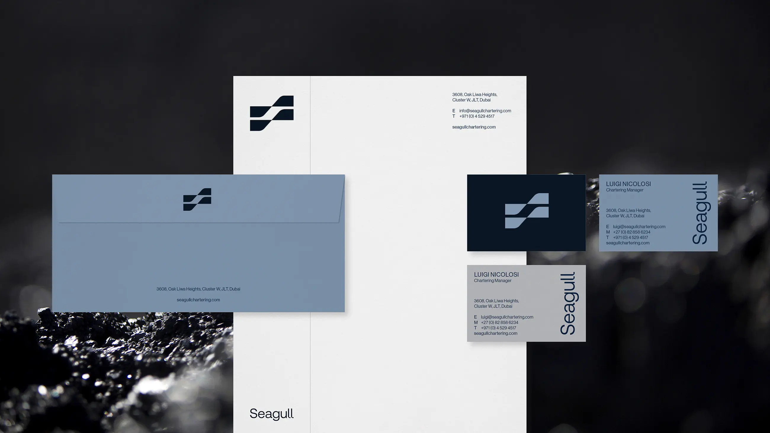
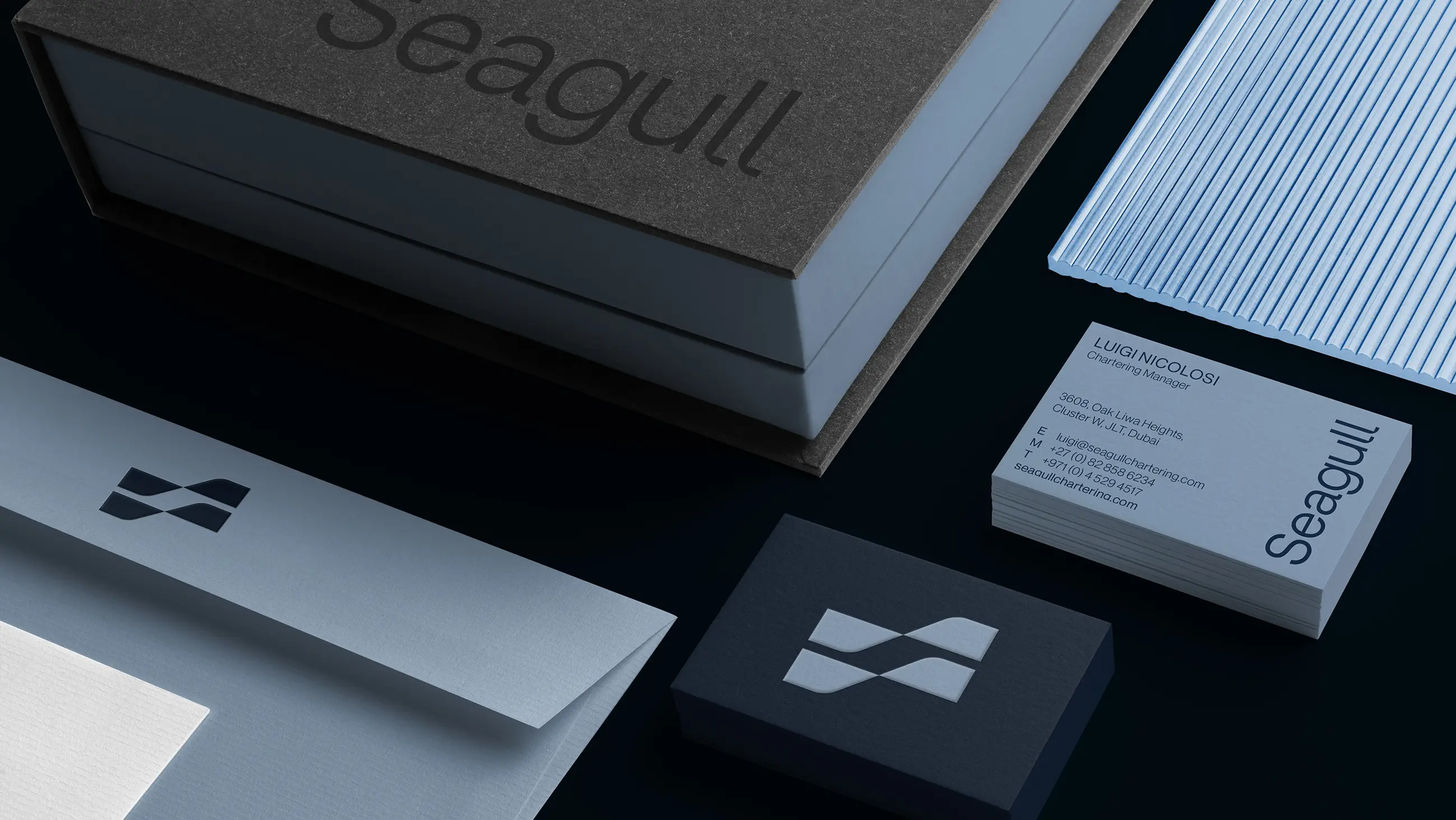
Print Collaterals


The brand icon subtly incorporates an 'S' in the negative space, a nod to Seagull, while retaining the form of a nautical flag that reinforces the company’s core operations.
Next project
Safa Community School ↗
If you’ve got a project you’d like to discuss or would like to collaborate, feel free to get in touch.
© Ryan Hartley 2026
Creative Director & Designer
