© Ryan Hartley 2026
Creative Director & Designer
Creative Director & Designer
Flipz Burgers - Flipping flavours on their heads. An identity that transforms street culture into bold flavour and unforgettable experiences.
Challenge
The goal was to create a rebellious brand rooted in street culture, bold but never brash, authentic without being cheesy or disconnected. It needed to feel true and unapologetic, bringing the bold flavours of the burgers and shakes to life.
Branding
Flipz needed a colour that felt distinctive and full of flavour — lilac became the natural choice. Bold and unexpected, it reflects the brand’s rebellious energy and standout attitude.
The logo flips the lowercase ‘i’ into an exclamation mark, giving the wordmark its own voice without being forced or overly literal. Paired with a bold display typeface that mirrors the movement and attitude of counterculture, the identity is designed to disrupt.
The logo flips the lowercase ‘i’ into an exclamation mark, giving the wordmark its own voice without being forced or overly literal. Paired with a bold display typeface that mirrors the movement and attitude of counterculture, the identity is designed to disrupt.
Photography
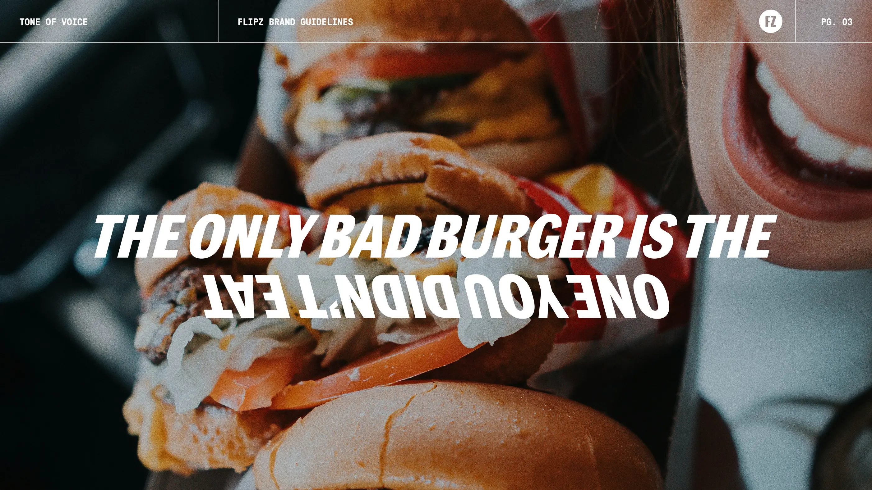
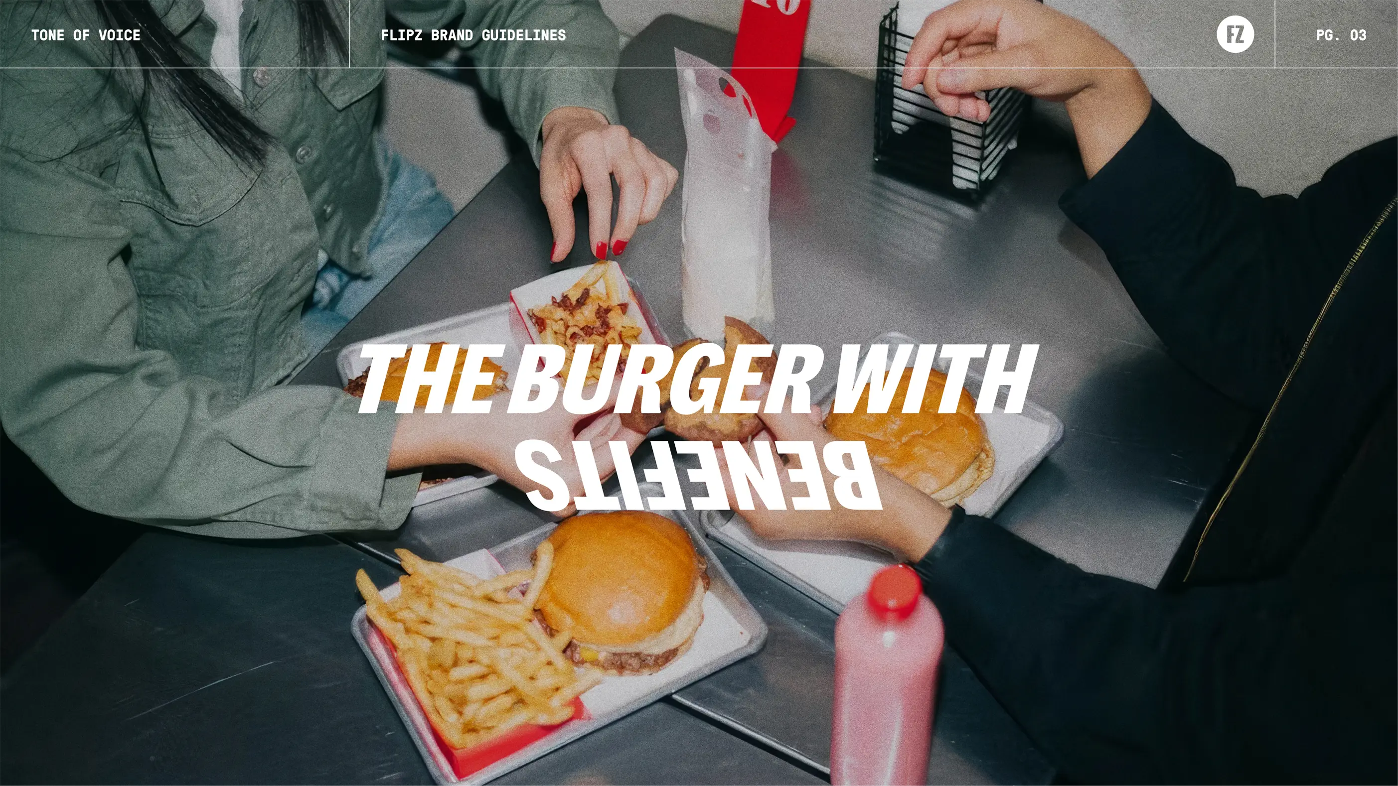
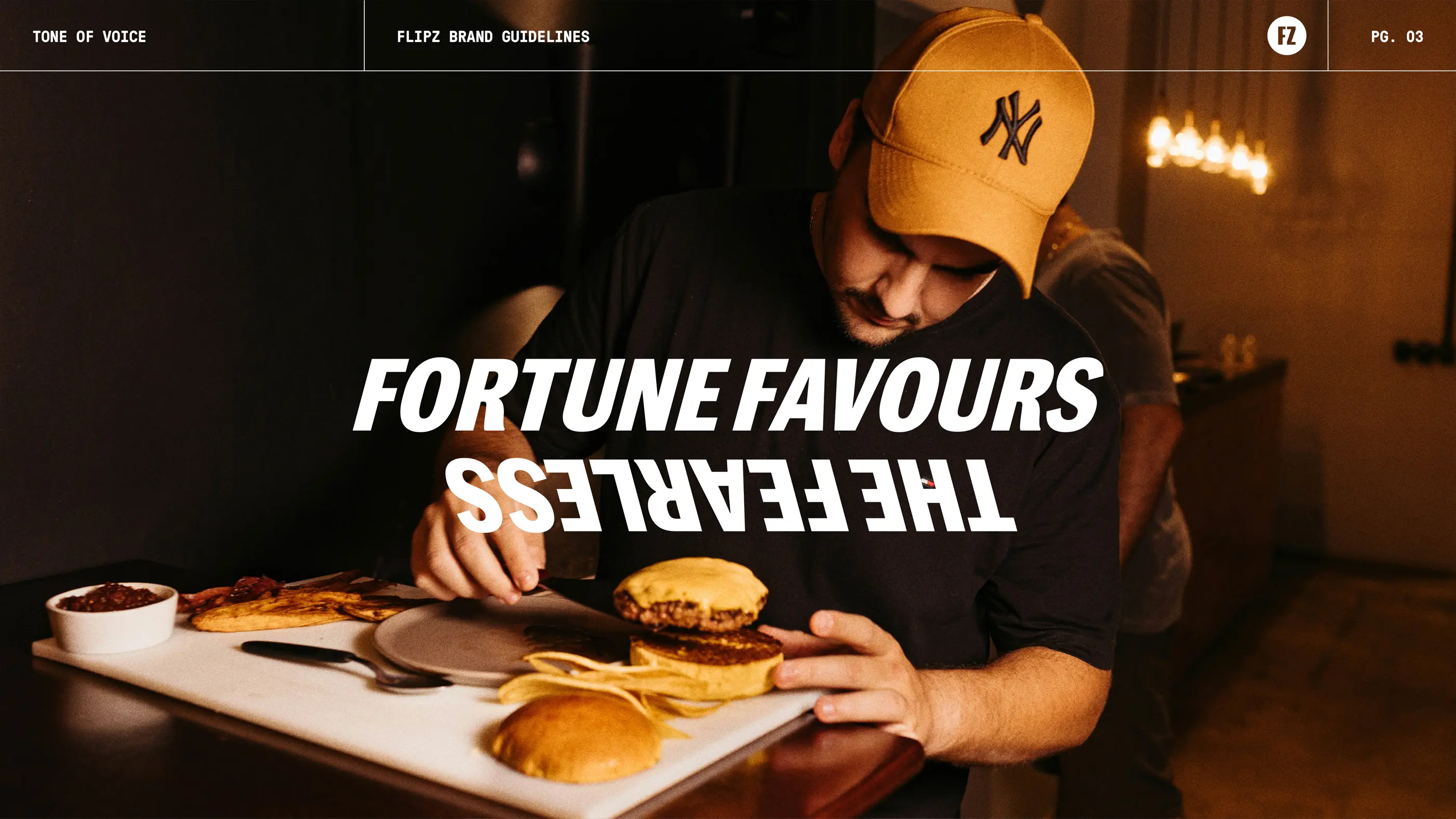
The photography style is raw, unapologetic, and celebrates food in all its messy glory. Bright flashes, grainy textures, and unfiltered moments bring the brand to life, staying true to its positioning of flipping flavours on their head.
Strategy
Brand Identity
Visual Language
Brand Manual
Social Media
Print Collaterals
Packaging


“Flipping Flavours on the Head” is not just a catchy slogan; it’s their bold commitment to reinventing the burger experience.


Next project
KBH Group ↗

If you’ve got a project you’d like to discuss or would like to collaborate, feel free to get in touch.
© Ryan Hartley 2026
Creative Director & Designer