© Ryan Hartley 2026
Creative Director & Designer
Creative Director & Designer
KBH Group - Powered by our Community. Operating across the industrial and mining sectors, with a focus on sourcing and delivering essential minerals and metals with precision and scale.
Challenge
As KBH Group entered a phase of significant growth and diversified its portfolio, its existing identity lacked the cohesion needed to unify its expanding verticals. To address this, a branded house approach was adopted, aligning all vertical companies under one cohesive brand architecture.
Strategy
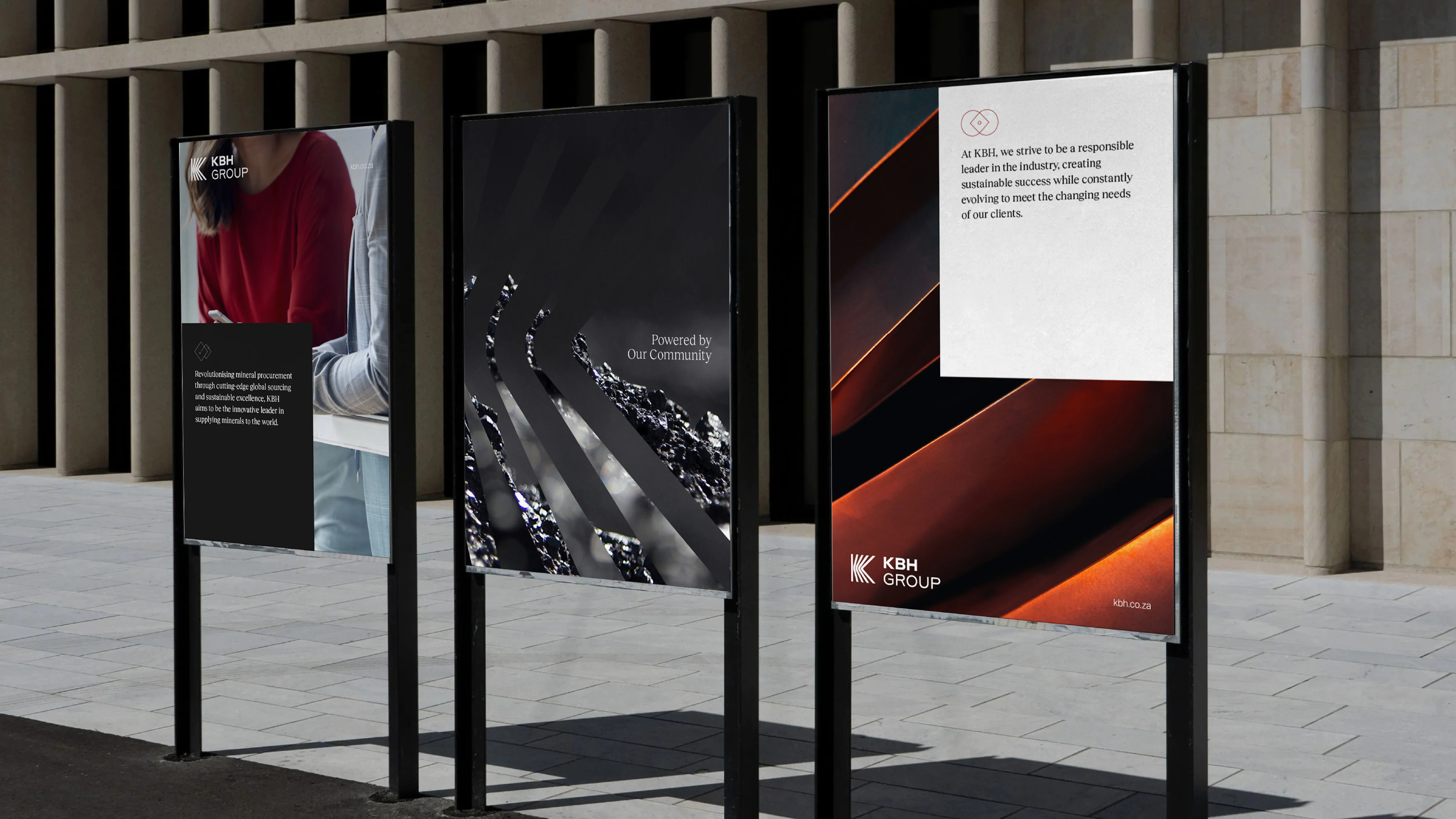
KBH Group operates in remote rural areas across South Africa, where many residents work in its mining operations. Community development, through education, healthcare, and infrastructure, became a central focus. This connection formed the foundation for the rebrand, especially the new logo.
Branding
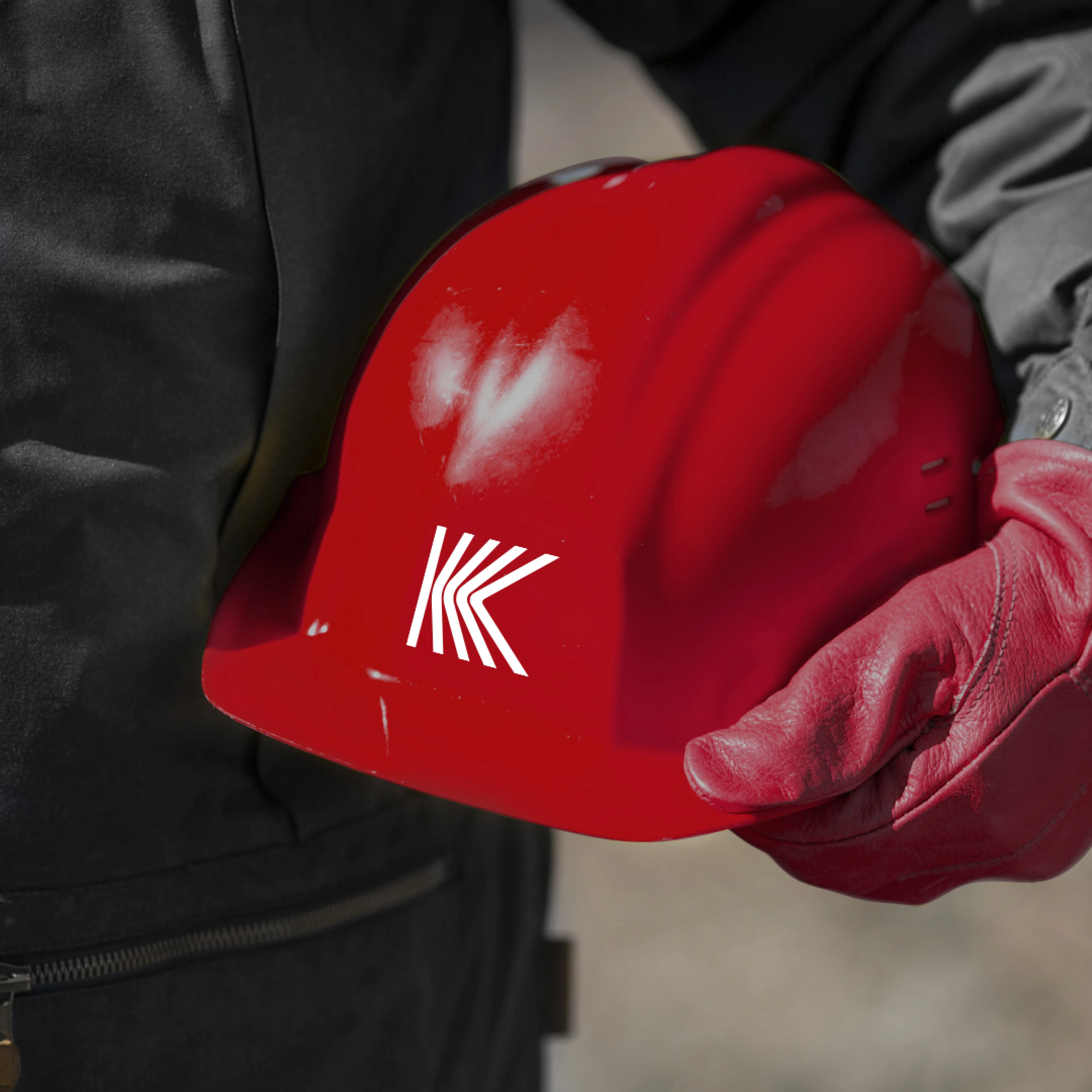
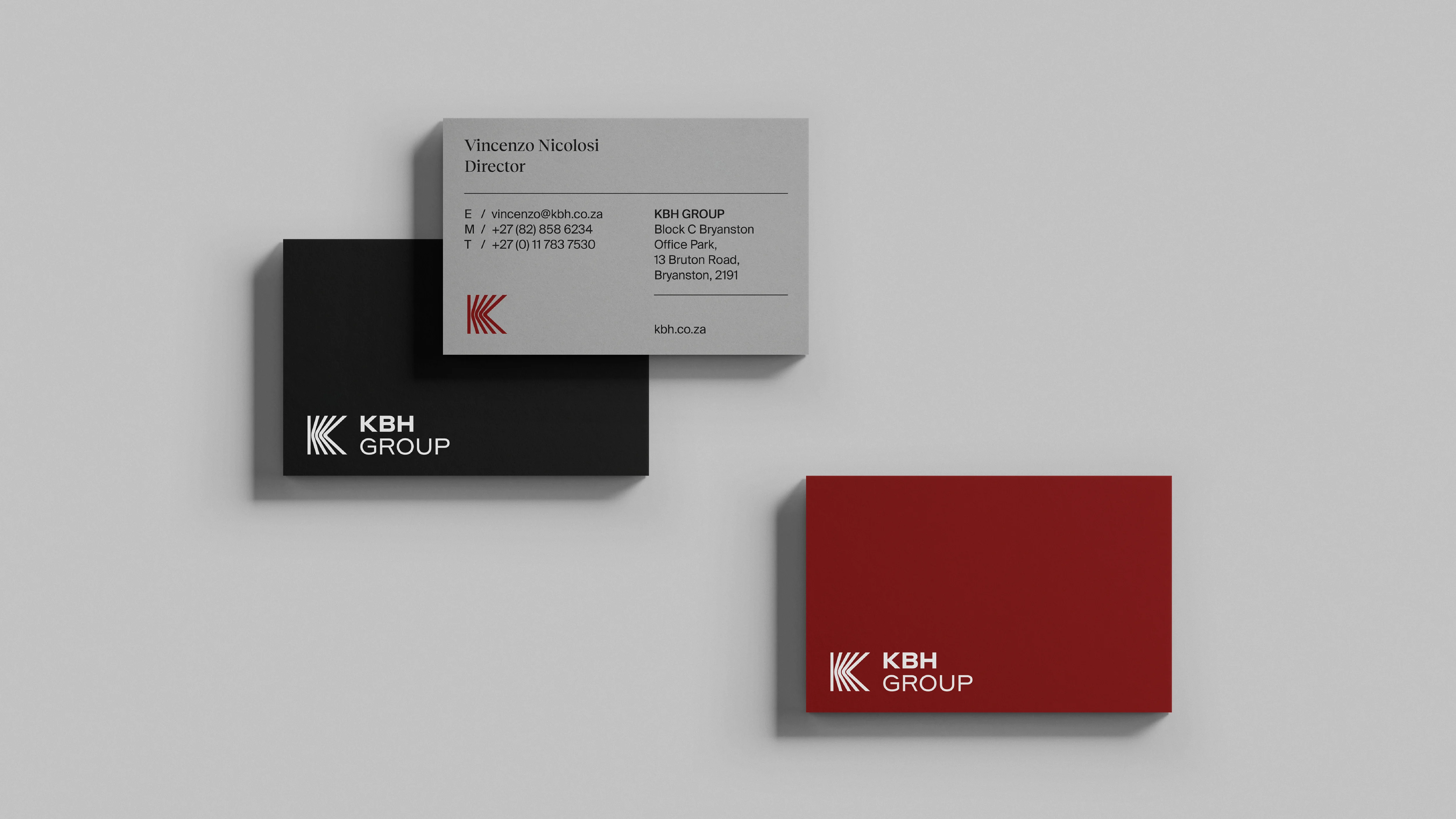
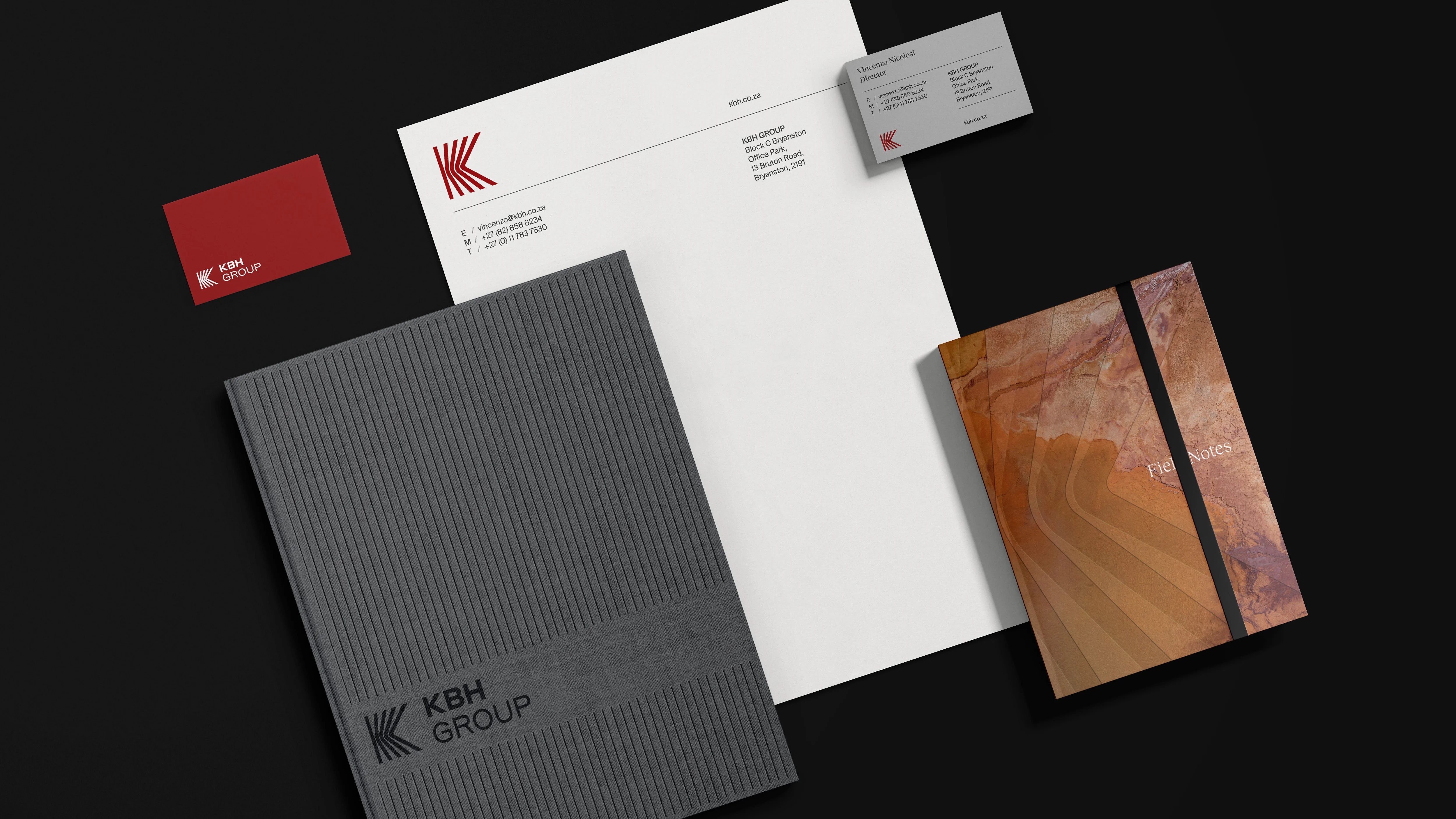
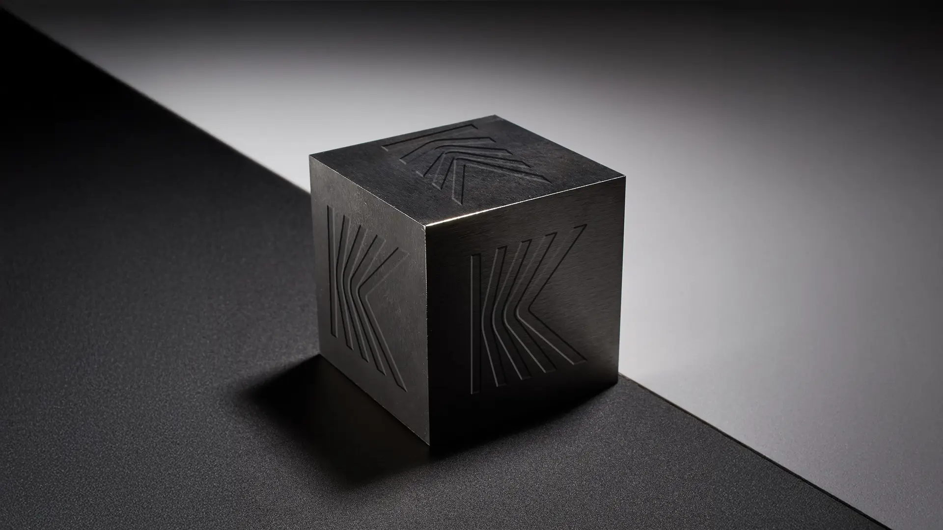
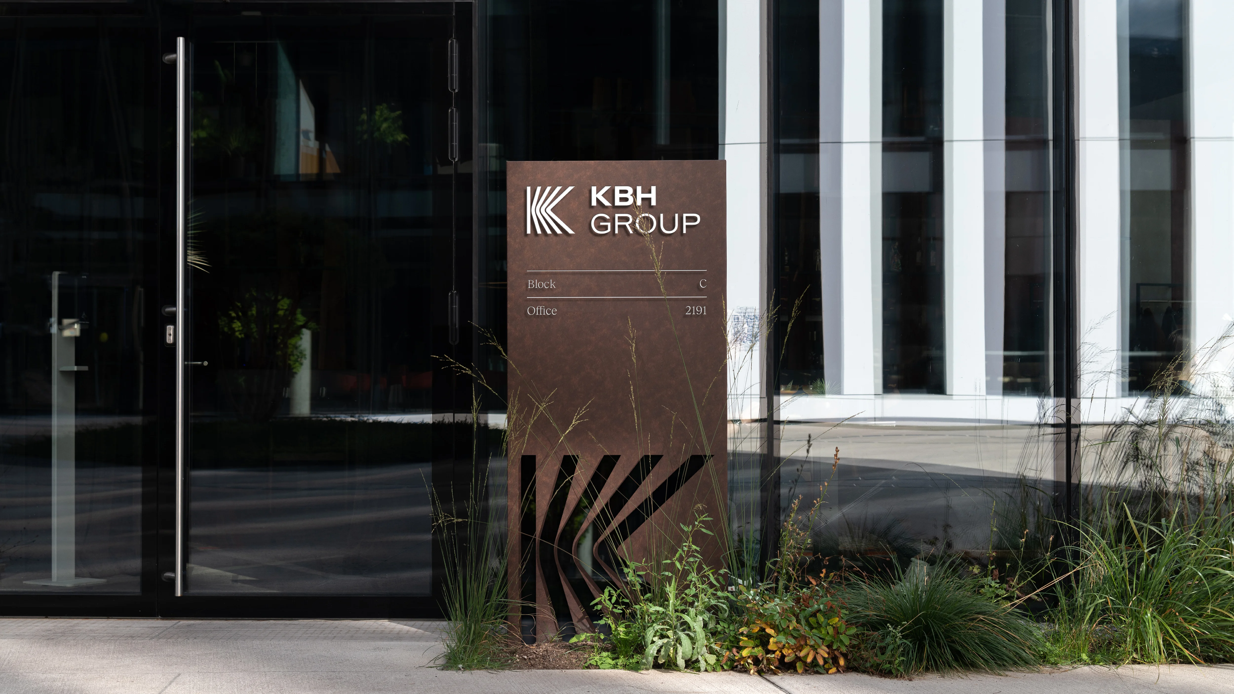
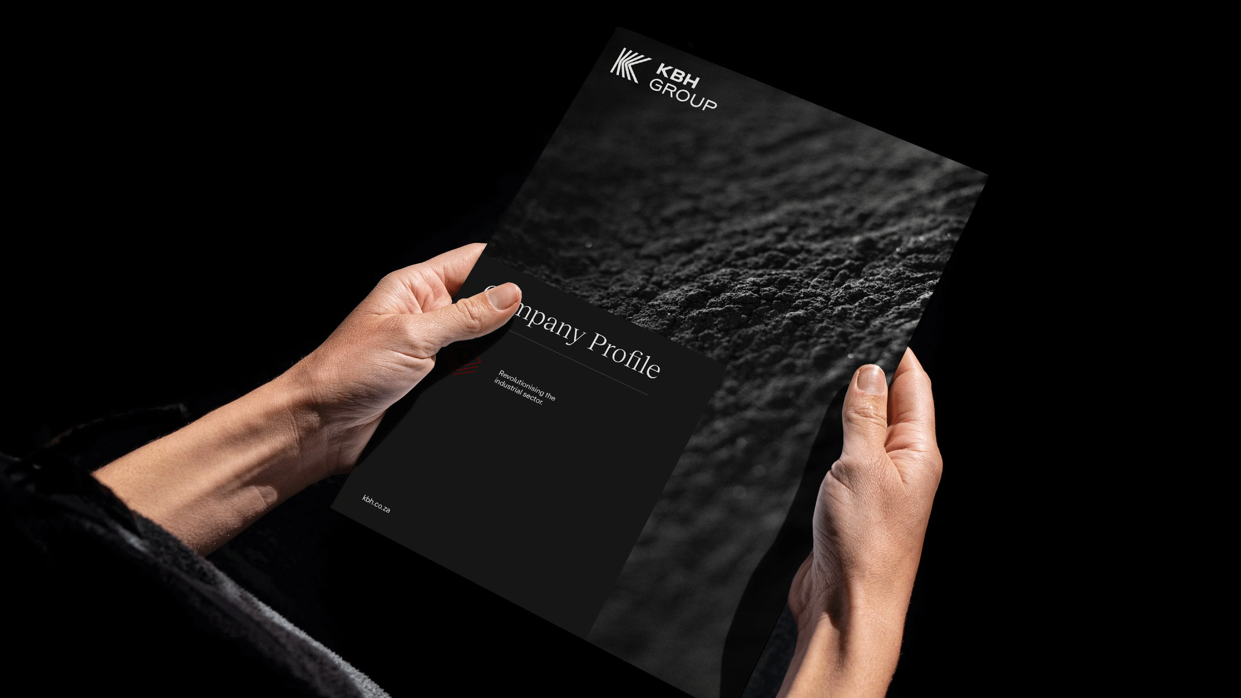
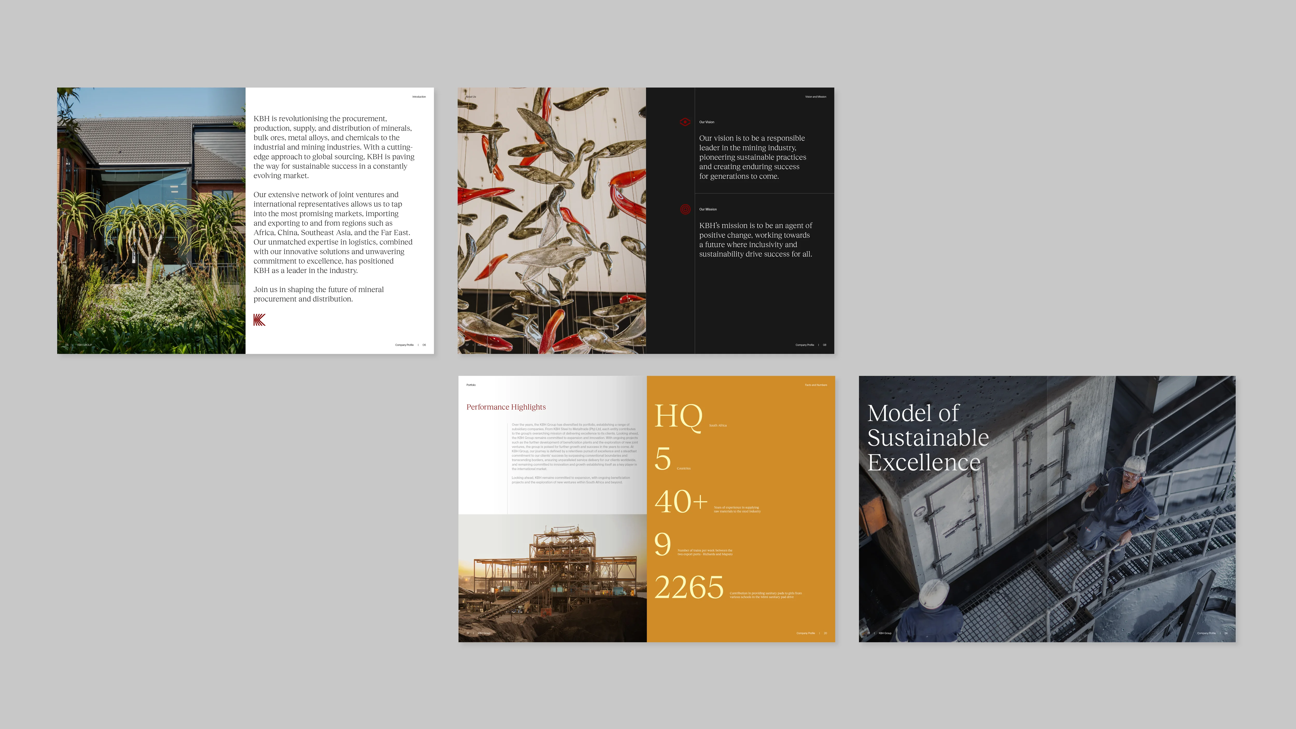
At the core of the brand identity are the ideas of precision, extraction, and distribution, all reflected in the brand mark’s icon. A dynamic visual language built around this icon reinforces the precision of their operations in an engaging way, enhancing both photography and print collateral.
Strategy
Brand Architecture
Brand Identity
Visual Language
Brand Manual
Print Collaterals
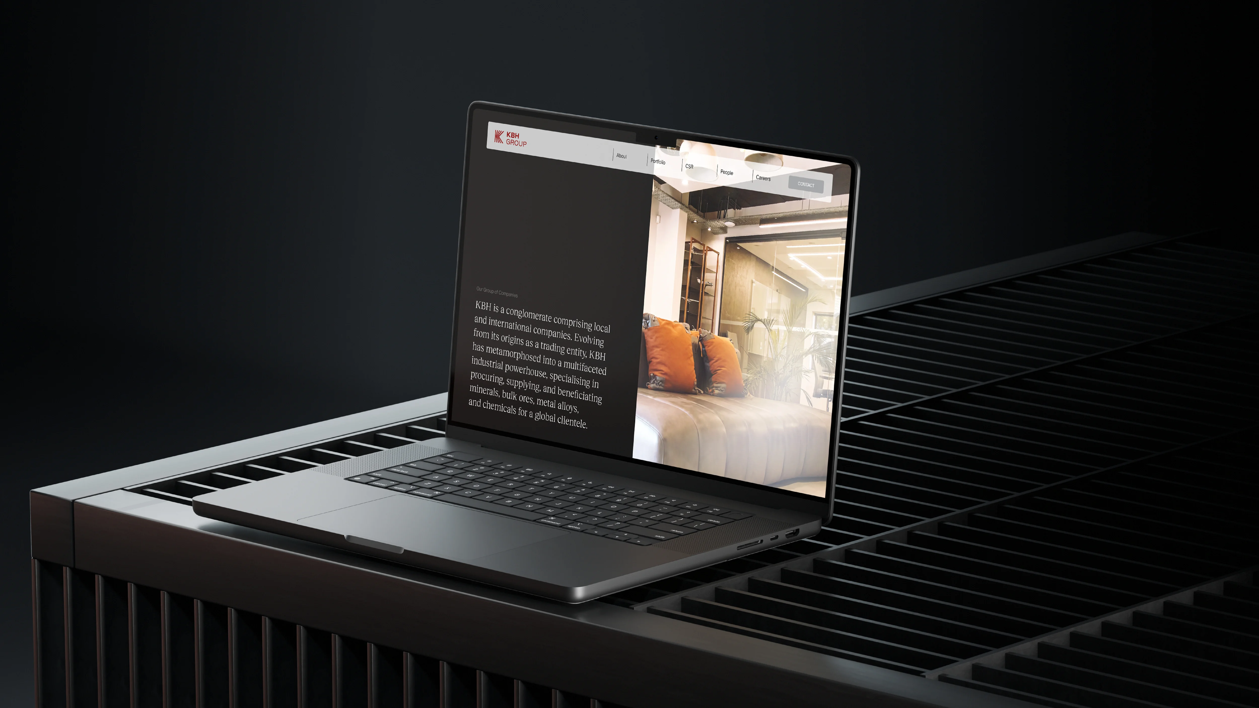
UI & UX Design
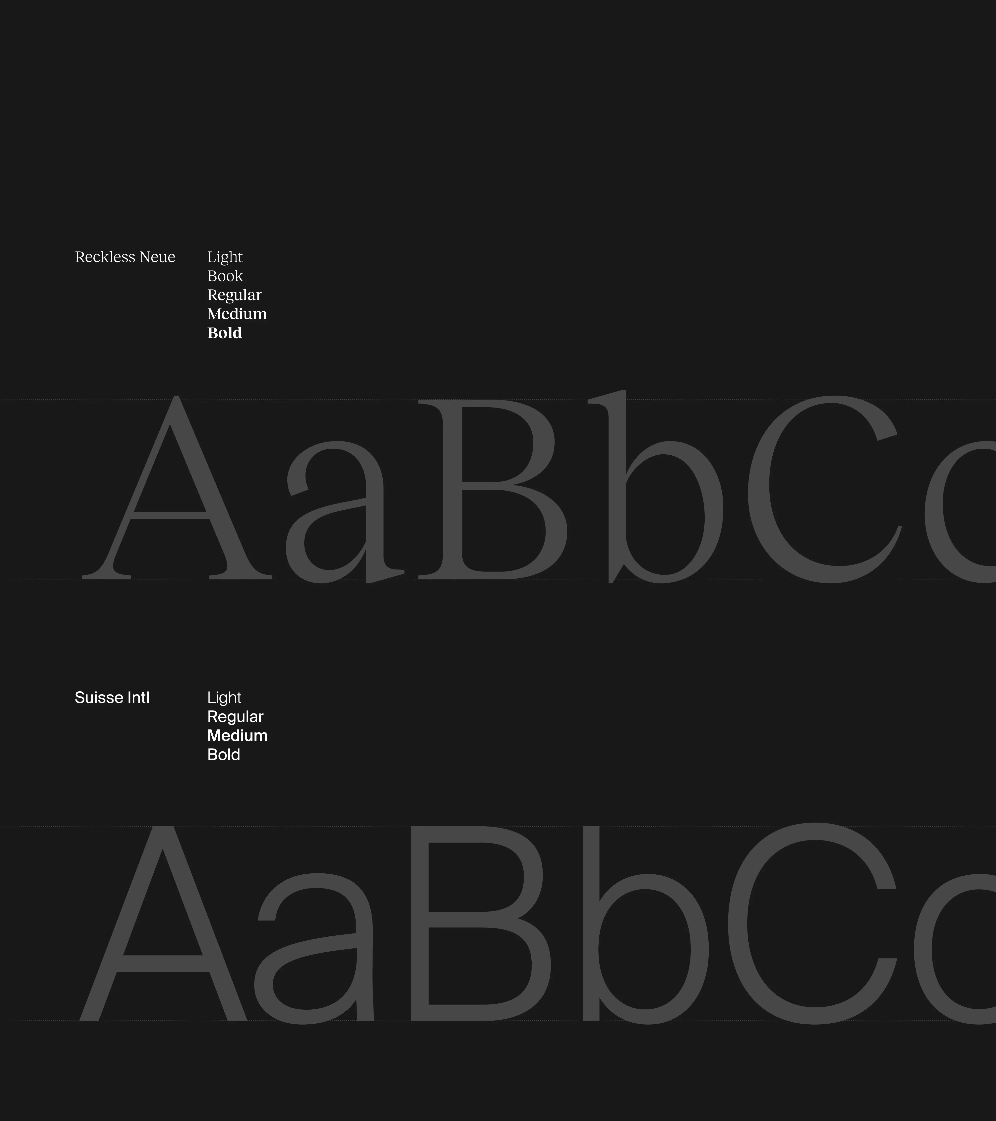
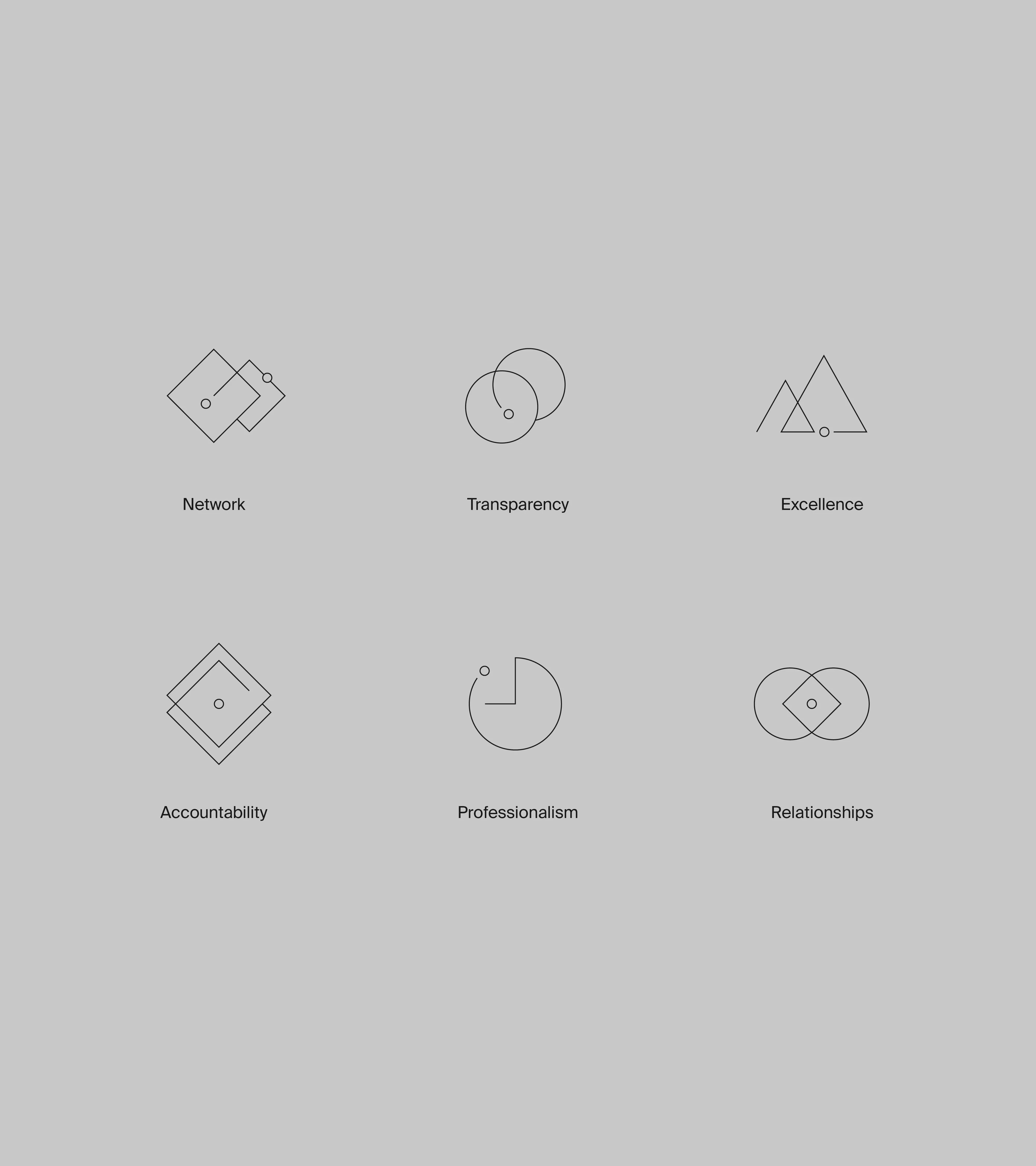

The strategic framework repositioned KBH Group, clarified their core values, and set the stage for their next chapter of growth.


Next project
Catexel ↗

If you’ve got a project you’d like to discuss or would like to collaborate, feel free to get in touch.
© Ryan Hartley 2026
Creative Director & Designer